本周小作文写作预测新鲜出炉? 可参考日期:11月1日-7日
1. 题目和图片
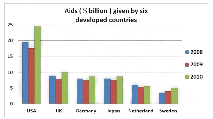
The chart below shows the aid amount (5 billion)that six developed countries gave to developing countries.Please summarise the information by selecting and reporting the main features and make comparison where relevant.
2. 思路提纲
3. 高分范文示例
Given is a column graph that displays the monetary assistance bestowed by industrialized
countries to developing nations in three subsequent years.
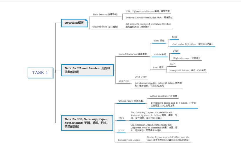
Generally, with the exception of Sweden, the amounts of money given by the various areas
oscillated over the period. In addition, the USA and Sweden provided the most and least
considerable financial contribution, successively.
In particular, the United States donated slightly less than $20 billion to developing countries
in 2008, but the level minimally lessened after a year before soaring to nearly $25 billion in
2010. On the contrary, Sweden’s contributions steadily climbed but did not go beyond $5
billion.
Concerning the monetary aid provided by the UK, Germany, Japan, and the Netherlands, they
all exhibited similar fluctuations within the given time scale, all reducing by about $1 billion
in 2009 before experiencing disparate levels of increment in 2010. Additionally, their range
remained between $5 billion and $10 billion, with Germany and Japan’s figures being nearly
identical around $8 billion over the years.
Word Count: 164
4. 高分词汇或表达
(1) column chart: 柱状图
(2) monetary assistance: 货币援助
(3) bestowed: 授予
(4) subsequent years: 后续几年
(5) with the exception of: 除了...之外
(6) oscillated: 波动
(7) financial contribution: 财政贡献
(8) successively: 连续地
(9) donated: 捐赠
(10) minimally lessened: 最小程度减少
(11) On the contrary: 相反地
(12) did not go beyond: 没有超过
(13) Concerning the monetary aid: 关于货币援助
(14) within the given time scale: 在给定的时间尺度内
(15) disparate levels of increment: 不同幅度的增长
(16) identical: 相同
1、题目和图片
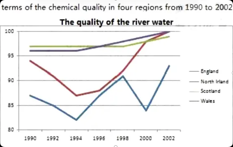
The graph below shows the percentage of river water in the UK that is of good chemical quality, in the period between 1990 and 2002.
2、思路提纲
3、高分范文示例
The line chart displays the rates of river water with excellent chemical quality in the United Kingdom in more than a decade.
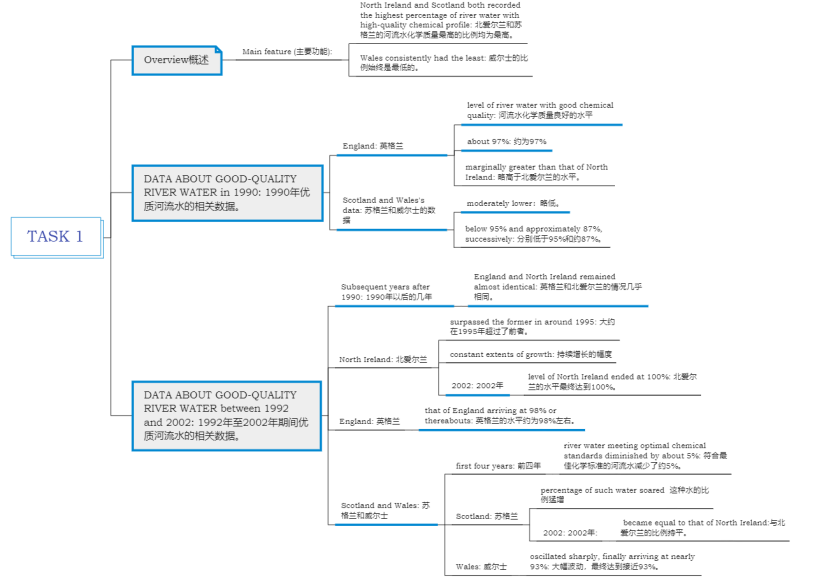
Overall, North Ireland and England both recorded the highest percentage of river water with high-quality chemical profile in most years, except in 2002, whereas Wales consistently had the least.
To be specific, in 1990, the level of river water with good chemical quality in England was about 97%, marginally greater than that of North Ireland. However, those of Scotland and Wales were moderately lower, at just below 95% and approximately 87%, successively.
In the subsequent years, the figures for river water meeting optimal chemical standards England and North Ireland remained almost identical, but the latter surpassed the former in around 1995. With constant extents of growth, the level of North Ireland ended at 100%, with that of England eventually arriving at 98% or thereabouts. As for the others, they both diminished in the first four years by about 5% and after that, the percentage of such water in Scotland soared and became equal to that of North Ireland in 2002, whereas that of Wales oscillated sharply, finally arriving at nearly 93%.
Word Count: 193
4、高分词汇或表达
(1) excellent: 优质的
(2) a span of more than a decade: 超过十年的跨度
(3) consistently: 一贯
(4) To be specific: 具体来说
(5) marginally greater than: 略高于
(6) moderately lower: 略低一些
(7) successively: 分别
(8) In the subsequent years: 在接下来的几年里
(9) almost identical: 几乎相同
(10) with high-quality chemical profile: 具有高质量的化学指标
(11) extents of growth: 增长幅度
(12) eventually arriving at: 最终达到
(13) meeting optimal chemical standards: 符合最佳化学标准
(14) or thereabouts: 左右
(15) diminished: 减少
(16) soared: 飙升
(17) oscillated sharply: 大幅波动
1、题目和图片
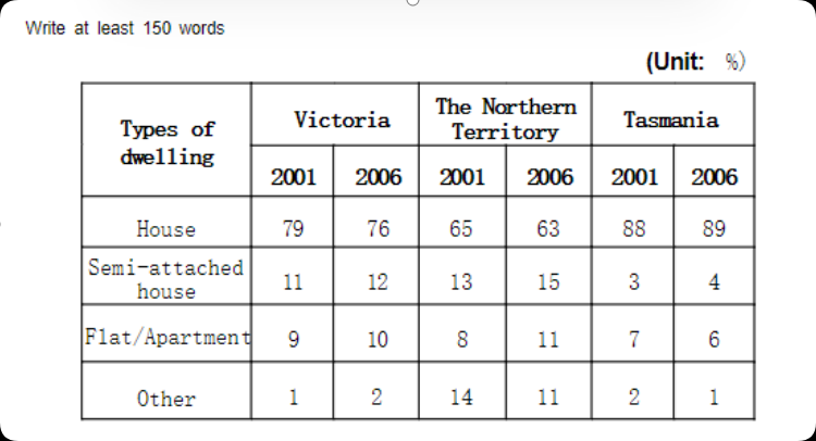
The table below shows the percentage of main types of dwelling in Victoria,the Northern Territory and Tasmania. Summarise the information by selecting and reporting the main features and make comparison where relevant.
2、思路提纲
3、高分范文示例
Given is a chart that compares three Australian regions in terms of the rates of various classifications of residences in two separate years.
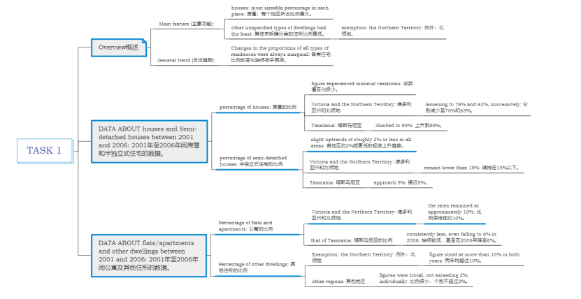
Generally, houses had the most sizeable percentage in each place, whereas other unspecified types of dwellings had the least, except for the Northern Territory. Furthermore, the changes in the proportions of all types of residences were always marginal.
In particular, between 2001 and 2006, the figure for houses experienced minimal variations, with those for Victoria and the Northern Territory lessening to 76% and 63%, successively, and that for Tasmania climbed to 89%. By comparison, slight uptrends of roughly 2% or less were observed in the data of semi-attached houses in all areas, with those of the two former regions remaining lower than 15% and that of the latter approaching 5%.
Concerning flats and apartments, the rates remained at approximately 10% in both years in Victoria and the Northern Territory, whilst that of Tasmania was consistently less, even falling to 6% in 2006. Moreover, excluding the Northern Territory where the figure for other dwellings stood at more than 10% in both years, those for the others were trivial, not exceeding 2%, individually.
Word Count: 194
4、高分词汇或表达
(1) classifications of residences: 住宅分类
(2) the most sizeable: 最大的
(3) unspecified types of dwellings: 未明确分类的住所
(4) except for: 除了
(5) marginal: 微小的
(6) minimal variations: 变化极小
(7) lessening: 减少
(8) In particular: 尤其是
(9) whilst: 同时
(10) successively: 依次
(11) slight uptrends: 轻微的上升趋势
(12) were observed: 被观察到
(13) approaching: 接近
(14) By comparison: 相比之下
(15) Concerning: 关于
(16) consistently less: 始终较低
(17) of roughly 2% or less: 约2%或更低
(18) trivial: 微不足道
(19) not exceeding: 不超过
(20) individually: 各自
(21) excluding: 除外excluding


